I get asked this question constantly, usually right before someone buys a $40 eyeshadow palette they’ll use twice. So here’s my actual take: color theory works, but it’s a starting point, not a rulebook. The “wear orange to make blue eyes pop” advice you’ve read in every magazine since 2003 is technically correct — complementary colors do create contrast — but contrast isn’t the only thing that makes eye makeup look good. Skin tone, the whites of your eyes, even the lighting in your bathroom versus an office overhead light, all matter just as much.
That said, color theory is a genuinely useful shortcut when you don’t know where to start. Here’s what actually works for each eye color, plus where I think the standard advice oversells itself.
One more thing before the breakdown: none of this is about hiding your natural eye color or replacing it with something else. The goal is contrast and definition, not disguise. A lot of “which color makes your eyes pop” content treats eye color like a problem to be solved, when really it’s more like a starting ingredient — you’re choosing what to put next to it, not trying to overpower it.
Brown Eyes
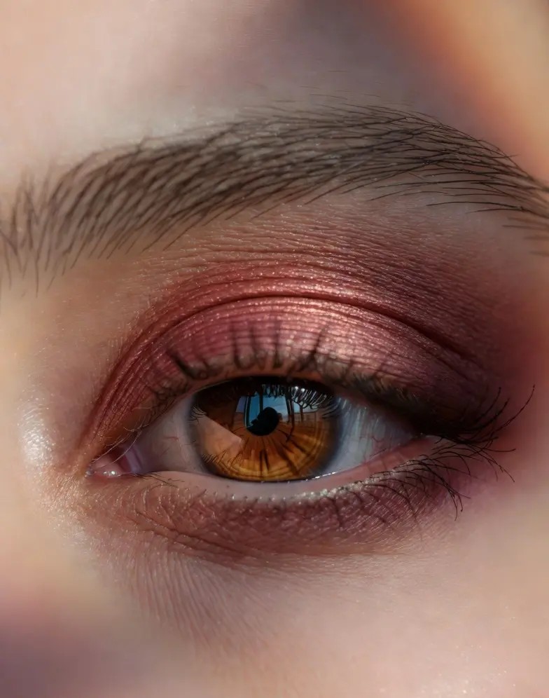
Brown is the most common eye color in the world, and also the most forgiving. Almost everything works on brown eyes, because brown sits in the middle of the color wheel and doesn’t clash with much. Purples and plums genuinely do something special here, though: they bring out warm flecks that neutral browns and taupes leave invisible. I’ve watched this happen on my own eyes with a single swipe of a burgundy cream shadow, and it’s not subtle.
Gold and copper are the safer, more office-appropriate version of the same effect. If your eyes are dark brown specifically, deep blues like navy or cobalt liner along the lower lash line will make the whites of your eyes look brighter, which reads as “awake” even if you slept four hours.
What I’d skip: brown eyeshadow on brown eyes. It’s not wrong, exactly, but it’s the makeup equivalent of wearing beige on beige — it disappears. If you want a “no makeup” look, fine, but don’t expect much definition.
Blue Eyes
This is where the orange-and-blue color wheel advice actually earns its reputation. Warm tones sit directly opposite blue on the wheel and make it look more saturated: copper, bronze, terracotta, peach. I’m not talking about literal orange eyeshadow, but anything in the bronze-to-rust family does the job without looking like a costume.
Brown eyeliner instead of black is the other trick worth knowing. Black liner on blue eyes can look harsh, almost like it’s competing with the eye color instead of framing it. A warm brown, or even a soft chocolate shade, does the framing job while letting the blue stay the star.
Cool-toned blues and silvers are the most overused choice for blue-eyed people, and I’ll say it plainly: a silver shimmer doesn’t make blue eyes “pop,” it just makes them look watery under bad lighting. Save the icy tones for nights out with controlled lighting, not for a Tuesday afternoon.
Green Eyes
Green is the rarest eye color, and people with green eyes often get told to wear purple, which is correct — purple and green are complements — but I think reds and coppers deserve more credit here. A warm copper shadow on green eyes does something color theory doesn’t fully capture: it makes the green look almost golden at the edges, especially in eyes with amber flecks near the pupil.
Plum, aubergine, and mauve are the more wearable purple options if you’re not ready for full violet eyeshadow on a weekday. They add depth without veering into costume territory.
One thing I’d push back on: the idea that green-eyed people should avoid green eyeshadow entirely. Olive and forest tones, used sparingly in the crease rather than swept across the whole lid, can deepen green eyes instead of washing them out. The rule against tonal makeup is overstated for green specifically. It just needs a slightly different shade than your actual eye color, not the opposite color on the wheel.
Hazel Eyes
Hazel is the chameleon of eye colors. It shifts between green, brown, and gold depending on what’s near it, which makes it the most fun and the most frustrating to shop for. Whatever color sits closest to the iris tends to get amplified, so this is one case where matching nearby colors works better than chasing the complementary-color rule.
Green and gold shadows bring out the green in hazel eyes. Warm browns and terracottas pull out the brown. Purple, especially a dusty mauve, tends to make the gold flecks more visible by contrast, which is about the closest hazel gets to the standard “complementary colors” advice actually working as advertised.
If your hazel eyes lean more green, treat the green-eye section above as your starting point. If they lean brown, start with the brown-eye section instead. The honest truth is hazel eyes can wear almost any color and look like they “match” something, which is either liberating or annoying depending on how much you like having clear rules to follow.
Gray Eyes
True gray eyes are rare, and the advice for them is less established than for the other colors, mostly because there’s less of a tradition to draw from. Gray eyes tend to look most striking with smoky charcoal or graphite shadow, not because of complementary color theory, but because the tonal closeness intensifies the gray rather than competing with it. That’s the opposite of what works for brown eyes, where tonal matching tends to flatten things out.
Soft pinks and rose-toned shadows also do well on gray eyes, mostly because they warm up a cool eye color without overpowering it. I’d avoid heavy warm oranges here. On gray eyes they tend to read as mismatched rather than complementary, probably because gray doesn’t carry enough underlying warmth to balance against.
Finish Matters Almost as Much as Color
Nobody talks about finish enough in these guides, and it changes the outcome almost as much as the shade itself. A matte copper and a shimmery copper read completely differently on blue eyes: the matte version looks like contrast, the shimmery version looks like a highlight that happens to share a color family. Neither is wrong, but they’re doing different jobs.
Shimmer and glitter amplify whatever undertone is already in your eye, which is why a gold shimmer looks incredible on hazel eyes with gold flecks and slightly flat on hazel eyes that lean more green. Matte shadow does the opposite: it sits there as a block of color and lets contrast do the work instead of light reflection. If you’ve bought the “right” shade for your eye color and still felt unimpressed by the result, check the finish before you blame the color. I made this mistake for years with a matte plum that did nothing for my brown eyes, then tried a shimmery version of almost the same shade and finally understood what everyone was talking about.
The Skin Tone Caveat
Here’s the part most “best makeup for your eye color” guides skip: skin tone changes all of this. A copper shadow that looks incredible on warm, olive-toned skin can look chalky or orange on very fair, cool-toned skin, regardless of eye color. Liner that frames brown eyes beautifully on deep skin tones might barely register on pale skin without a darker base underneath.
If you’ve tried a “perfect for your eye color” shade and it looked off, the eye color advice probably wasn’t wrong. It just didn’t account for your skin’s undertone. When in doubt, swatch on your inner wrist first, and trust the swatch over the chart.
Bottom Line
Color theory gives you a reasonable place to start, especially if you’re standing in a drugstore aisle with no idea what to buy. But the people who get the most compliments on their eye makeup usually aren’t following a chart exactly. They’ve figured out which specific shade, undertone, and finish works with their own combination of eye color, skin tone, and even the flecks and rings within their iris. Use the guide above as a first guess, not a final answer, and don’t be afraid to break it the moment you find a shade that works better than the “rules” say it should.
If you only take one thing from this, make it the swatch test. Hold a shade up to your eye in actual daylight before you commit to it on your lid — not under store fluorescents, not in a photo with a filter. Color theory can tell you which family of shades is worth trying. It can’t tell you exactly how a specific copper, plum, or charcoal will sit against your specific eyes. That part you have to see for yourself.